In the previous article we set out to cover a new asset class: Bond investments. We saw how by including bonds together with stocks we could improve on our portfolio performance. Is this mixture still good given that we are now shifting in the interest rate cycle to a Bond Bear Market? In this article we go about calculating the Bond Index going back 120 years to answer this question.
Here is a chart since 1960 of US 1 and 10 year rates:
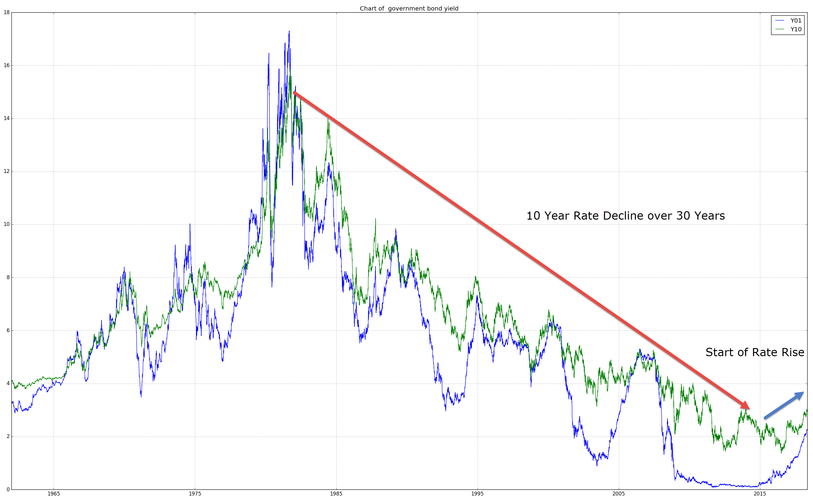
With rates starting to normalize and go higher, bond prices are entering a bear market. Is it still advisable to hold bonds?
These are tricky questions, in particular because easily accessible bond data is lacking, and so, performing any back testing or forward simulations is difficult.
This article sets out to rectify that. We will:
- Introduce you to a simple way to get decades worth of good quality data
- Determine how to create a reliable index of bond prices showing total return going back decades
- Figure out what bonds can actually do for us in this cycle.
Interest Rates and Bond Prices
Bonds are finite maturity instruments. Unlike a stock that you can hold for decades, a bond matures after a certain amount of time.
Bonds are also tricky for retail traders to trade; they’re not easily accessible. As we saw previously, this is where ETFs come to the rescue. Bond ETFs are like shares. You buy them and receive an income stream from the bond coupons. ETFs also don’t have a finite maturity.
So how is that we can buy a bond ETF, which like a share seems to hang around forever? And more importantly, given that these ETF bond prices only go back to 2002, how can we work out our own ETF proxies, extending them back far enough to produce some meaningful backtests.
To do this we have to break up our bond instrument into its parts and cover some basic bond maths.
Bond Background
A bond is made up of two components.
There is the underlying principal, which you as the bond buyer are lending to the bond seller. Since you are buying the bond, the money goes to the seller, who at maturity of the bond will give you the money back. So, buying a bond is just like lending money.
In the meantime, however, you will receive periodic payments. These are the bond coupon payments. Let’s have a look at an example.
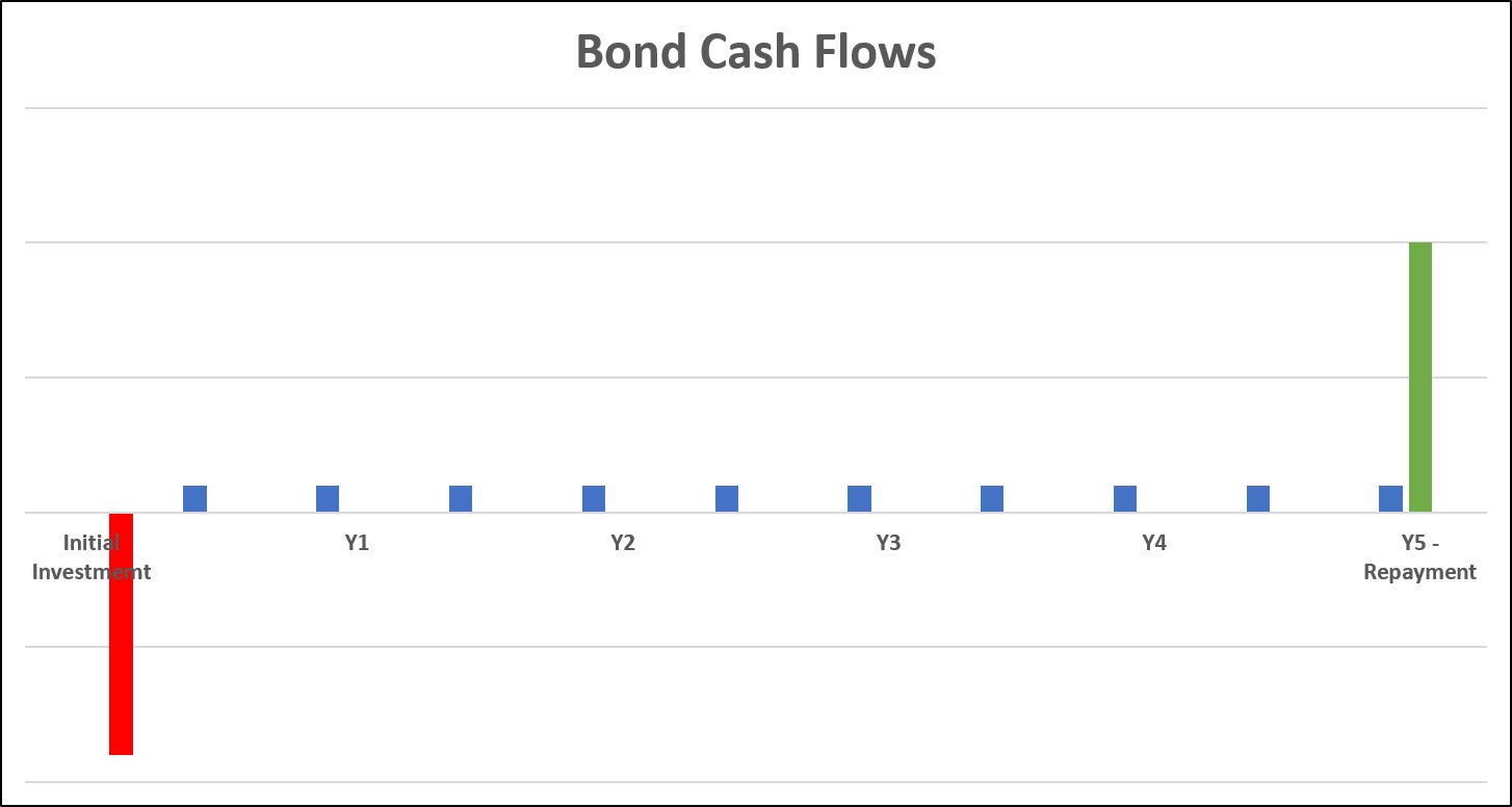
You start out by paying for the bond. That’s the red bar. Seen another way: you’re making a loan and in return you’re receiving a piece of paper that entitles you to regular (in this case semi-annual) interest payments, and a repayment at the end of the life of the bond. The income stream forms your annuity. The final payment is the principal re-payment on the loan you’ve given.
Ultimately what you care about is, how much am I lending and what am I getting in return for it. The series of repayments represents the amount you’re earning on your loan. In essence you can say that the stream of all these future cashflows is equal to the amount you are lending today.
I.e. your loan is the price of today’s bond.
And as you can see this amount (the red bar) is directly related to the interest rates in the market.
So let’s follow this up by looking at some real world bond prices.
Bond Quotes and Bond Prices
One thing you will find, is that getting individual bond data on the internet is more difficult than for equities.
One such source of data is the Frankfurt Stock exchange for various European bonds. One such example is the German government bond maturing in 2024, which is in six years from now. (Note that each bond has a unique identification number, called the ISIN number. In this case it is DE0001134922. Google it!)
Now its coupon is at 6.25%. This means that for every bond, with a face value of EUR 10,000, I would get EUR 625 annually (on the 4th of January). Note that unlike US Government Bonds, German bonds pay annually rather than semi-annually.
But hang on, you say. Interest rates in Germany are low right now. In fact 6 year rates are at -0.08% (you can check that over at marketwatch.com).
So what’s going on? Is this money for free?
Actually the quoted price on the exchange for this bond was at 136.20 on Monday September 10, 2018. So to own that EUR 10,000 of bond I would have to fork over EUR 13,420 right now. Now remember, that in 2024, I get the original EUR 10,000 back, plus a series of annual coupons (worth EUR 625 every 4th of January), I’m actually looking to get back EUR 13,750 (just naively adding up all the cash-flows), which is more or less in line with the current price of money invested, and equates to roughly 0% return over these six years. Exactly where the market puts 6 year German yields.
In essence because everybody asked the same bright question: “Money for free?” they rushed in and pushed that bond price up, until the rate of return equaled to other interest rate instruments in the market. Hence the concept of no free lunch in economics. People tend to rush in and equalize prices so that such anomalies disappear quickly. This is also known as arbitrage trading: exploiting mismatches in prices between equivalent instruments.
To put the above example into context, this bond was issued back in 1994, when 30 year rates were roughly at 6.25%, and hence its coupon wasn’t so out of whack. At that time the bond most likely trade at “par,” meaning it’s market price was equal to it’s face value. That is the EUR 10,000 bond actually traded for a price of EUR 10,000.
Bond Prices and Interest Rates
So as interest rates decrease, the bond price trades above par. The capital loss you make on receiving par value at redemption counteracts the yield gain on the high coupons during the lifetime of the bond.
This simple example drives the point home, that interest rates determine price and vice versa.
However, the relationship isn’t one-for-one. I.e. in technical jargon: the relationship isn’t linear. The actual relationship between a bond price and interest rates is non-linear.
If I were to plot the relationship it wouldn’t be a straight line. Here’s the behavior of a 30 Yr bond’s price as interest rates change. The blue line shows the price / interest rate relationship, the orange line shows what a linear relationship would look like.
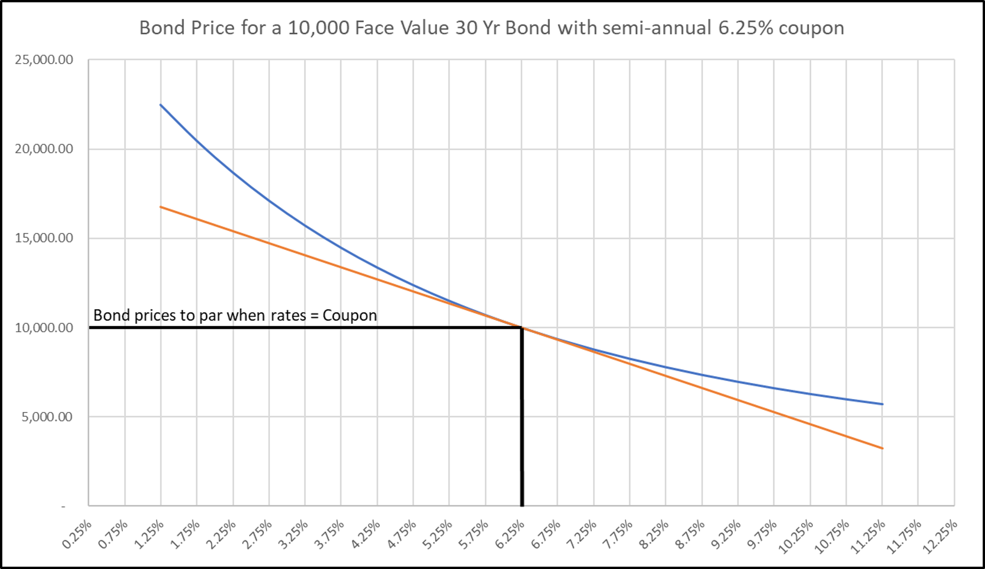
Two things stand out here:
- The actual price – rate relationship is upward curving
- The curvature for low rates is higher than for higher rates
This curvature is called convexity. And we can reformulate the relationship thus: high coupon bonds have a higher convexity than low coupon bonds (compared to current rate levels). And furthermore, higher convexity means that bonds are more sensitive to rate movements. You will also find that longer maturity bonds tend to have higher convexity than shorter maturity bonds.
From this chart you can see that in a falling rate environment people tend to want to hold higher convexity bonds, as it affords them a more levered position with respect to the underlying interest rates. Vice versa in a rising rate environment the opposite is true.
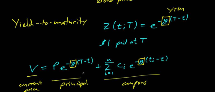
So how did we get this chart up? For the more mathematically savvy here is the relationship we are using
\(\text{P}= \text{Annuity} + \text{Capital Repayment}\)
The Annuity here is the value of the future coupons you receive and the Capital Repayment is today’s value of the loan repayment to be made at the bond’s maturity.
If
- the yield on the bond today is \(r%\),
- your coupon is \(C\),
- your time to maturity is \(T\),
- your loan Notional is \(N\),
- and you make semi-annual payments the formula reduces to:
\(\begin{align}P(r,C) & = \displaystyle\sum_{i=1}^{2T}\frac{\frac{C}{2}N}{\left(1+\frac{r}{2}\right)^i} + \frac{N}{\left(1 + \frac{r}{2}\right)^{2T}} \\\\ & = \frac{CN}{r} \left(1 – \left(1 + \frac{r}{2}\right)^{-2T}\right) + N\left(1 + \frac{r}{2}\right)^{-2T}\end{align}\)
On a technical note: this formula is true on Coupon payment day. In between coupons we need to take into account the accrual. The correction can be stated as:
\(P(r,C,t) = \left( 1 + \frac{r}{2}\right)^{t}\times P(r,C)\),
where \(t\) is the time from the previous coupon date as a year fraction.
This part becomes really important when we want to account for any money that we’ve made on the bond index as time passes, i.e. it allows us to take account of the coupon we are being paid.
This relationship between bond prices and interest rates will allow us to extrapolate price series into the past giving us a synthetic ETF for our backtesting and regime analysis.
And the good thing is we have interest rate data galore! Going back far enough that we can perform some useful analysis of what the future might bring!
Two sources we can look at are:
- Prof. Schiller’s website (which goes back to 1871).
- The US Treasury’s website (though we will be using Python and Quandl for this)
Our Bond Index in Action
In this section we’ll use the formula for bond prices above to create our own bond index. We’ll also check that our bond index makes sense, by comparing it to the current Bond ETFs and making sure our bond index tracks them appropriately.
Once we’ve covered that we’ll use a great property of interest rates that will allow us to make some educated estimates of future behaviour, allowing us to peek into the future.
Let’s start out by listing the ETFs we could compare our bond index to:
| Bond ETF | Maturities Covered | Date available from | CAGR | Sharpe Ratio | Max D/D |
|---|---|---|---|---|---|
| SHY | 1 - 3 yrs | 2002-07-30 | 1.9% | 1.35 | -2.2% |
| IEI | 3 - 7 yrs | 2007-01-11 | 3.5% | 0.87 | -6.0% |
| TLH | 10 - 20 yrs | 2007-01-11 | 5.4% | 0.58 | -14.3% |
| TLT | > 20 yrs | 2002-07-30 | 6.9% | 0.51 | -26.6% |
| AGG | >1 yr | 2003-09-29 | 3.6% | 0.76 | -12.8% |
As we saw previously, the longer dated bond ETFs have a higher volatility, and hence a lower Share Ratio.
Now let’s try to replicate some these ETFs by using the rates available from the US Treasury’s website.
The simplest one to replicate is the TLT, as it is primarily driven by long rates, which have been relatively flat in recent history, unlike the other ETFs which span sections of the yield curve with more curvature.
We’ll track the history back to 2008. Primarily because the 30yr bond issuance has been patchy. The US government started selling 30yr bonds regularly in 1977, but discontinued them in October 2001. They then restarted issuing them in February of 2006.
The result is:
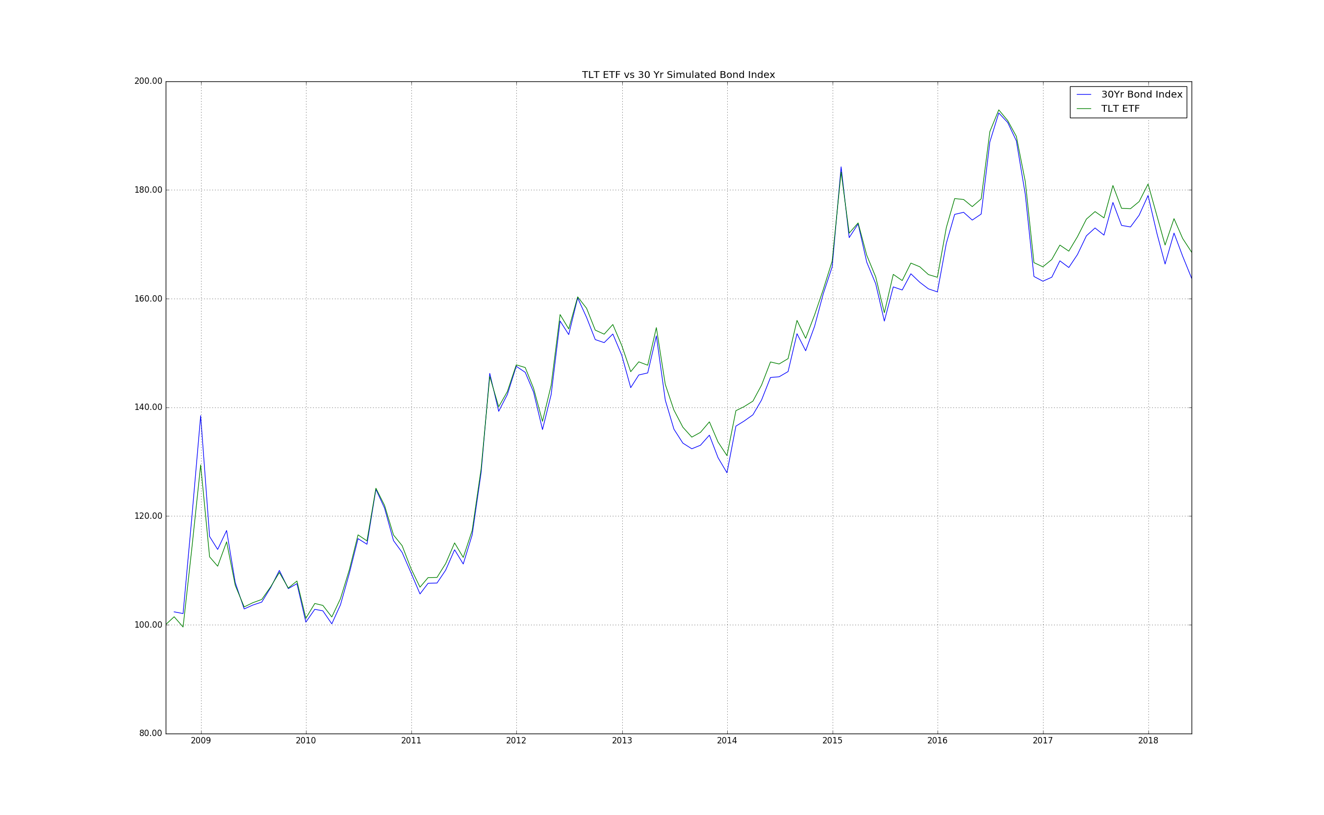
The replication methodology is very simple. At the start of every month we buy a par bond. At the end of the month we check our returns. These are made up of the accrued coupon and a change in price due to the change in rates
\(\begin{align}\Delta A &=\frac{r_{t-1}}{12}, \\\\ \Delta P &=\frac{Nr_{t-1}}{r_t}\left(1-\left(1+\frac{r_t}{2}\right)^{-2T}\right) + \left(1+\frac{r_t}{2}\right)^{-2T} – 1\end{align}\).
The assumptions here are that our bond notional is $1, and the yield of the bond we buy at the start of every month is the same as its coupon, which means its price is at par, i.e. equal to face value, which is the $1. This is a good approximation since the most recent bonds issued by governments tend to have coupons very close to the current yield.
So the total monthly change in value is the sum of these two components \(\Delta A + \Delta P\).
These two components give us two income streams which we can plot out for the same time period as the chart above:
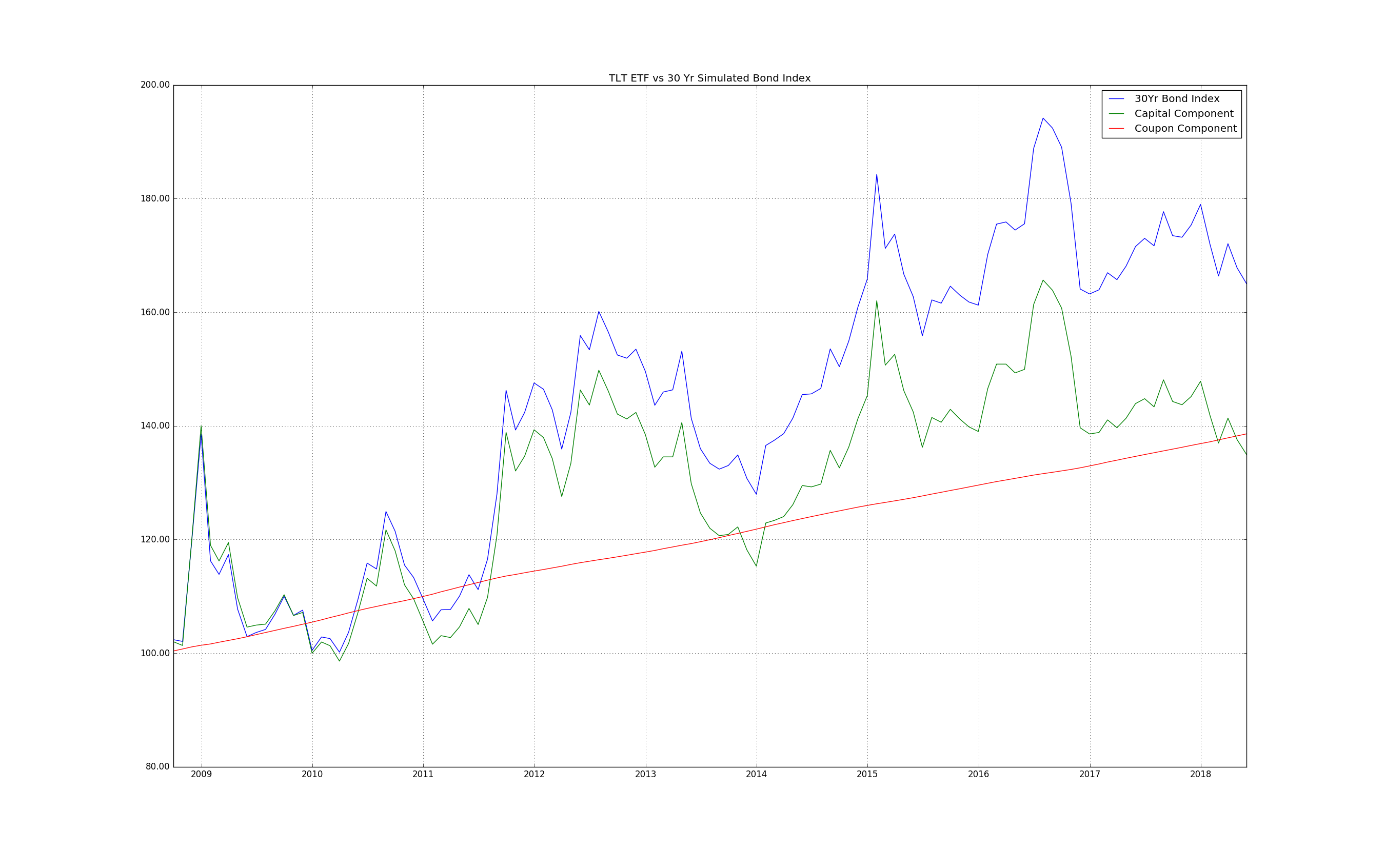
The take-away point here is that we make money both on the coupons we are receiving (the red line) as well as the capital appreciation due to declining rates, which result in rising bond prices.
We’ll have more to say about this when we try to predict possible outcomes: rising rates don’t necessarily mean losing money. It’s also the speed with which they rise, since if they rise too quickly it could be that our income doesn’t make up for the loss caused due to interest rate movements.
We can also create our bond indices for the interest rates available from the US Treasury website and create an equally weighted portfolio, to compare it to the AGG ETF, which is an aggregate of all bonds with maturity greater than one year. The result is:
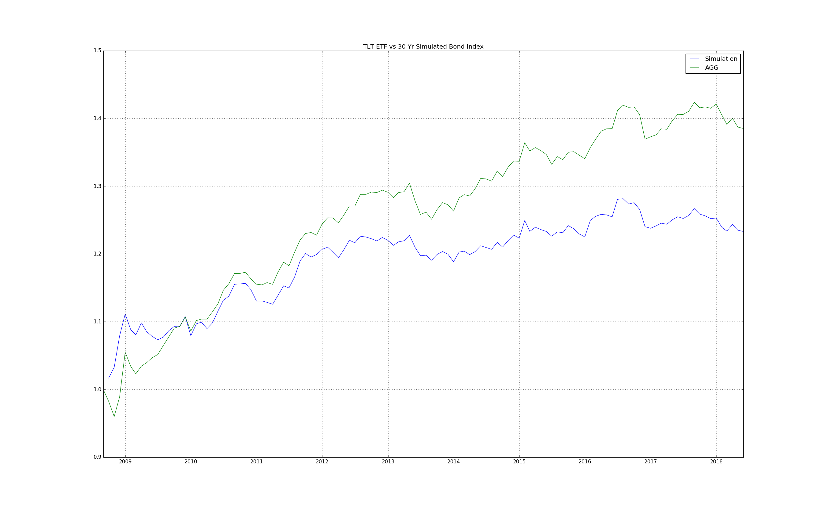
Looking at returns, our proxy tracks AGG movements closely, with a correlation on monthly returns of 97.8%. However, the AGG covers a universe of bonds larger than just government bonds. Government bonds make up 38%. 28% of the AGG are made up of mortgage backed securities (residential and commercial), 25% are corporate bonds, the remainder is made up of Sovereign / Supranational / Agency, and other bonds. Here sovereign means USD denominated foreign bonds, e.g. Hungary, Colombia, etc. This kind of discrepancy explains the difference in performance between our proxy and AGG.
Interest Rate History
So we are now in a position to start conducting backtests as well as present a possible future outcome given the current rise in rates.
Let’s start out by looking at 10 year rates going back to 1871, using Schiller’s data:
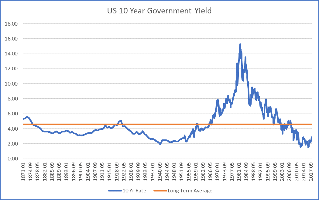
From the chart you can see that the data starts to become more granular from the start of 1953 onwards. Prior to that the observation periods are annual, with averaged values in between. Hence the smoothed nature of rates prior to 1953.
Regardless, let’s have a look at the relative behavior between the 10 year proxy we can construct from this yield series and the S&P 500 data from the same source. (Note we use log prices in these charts)
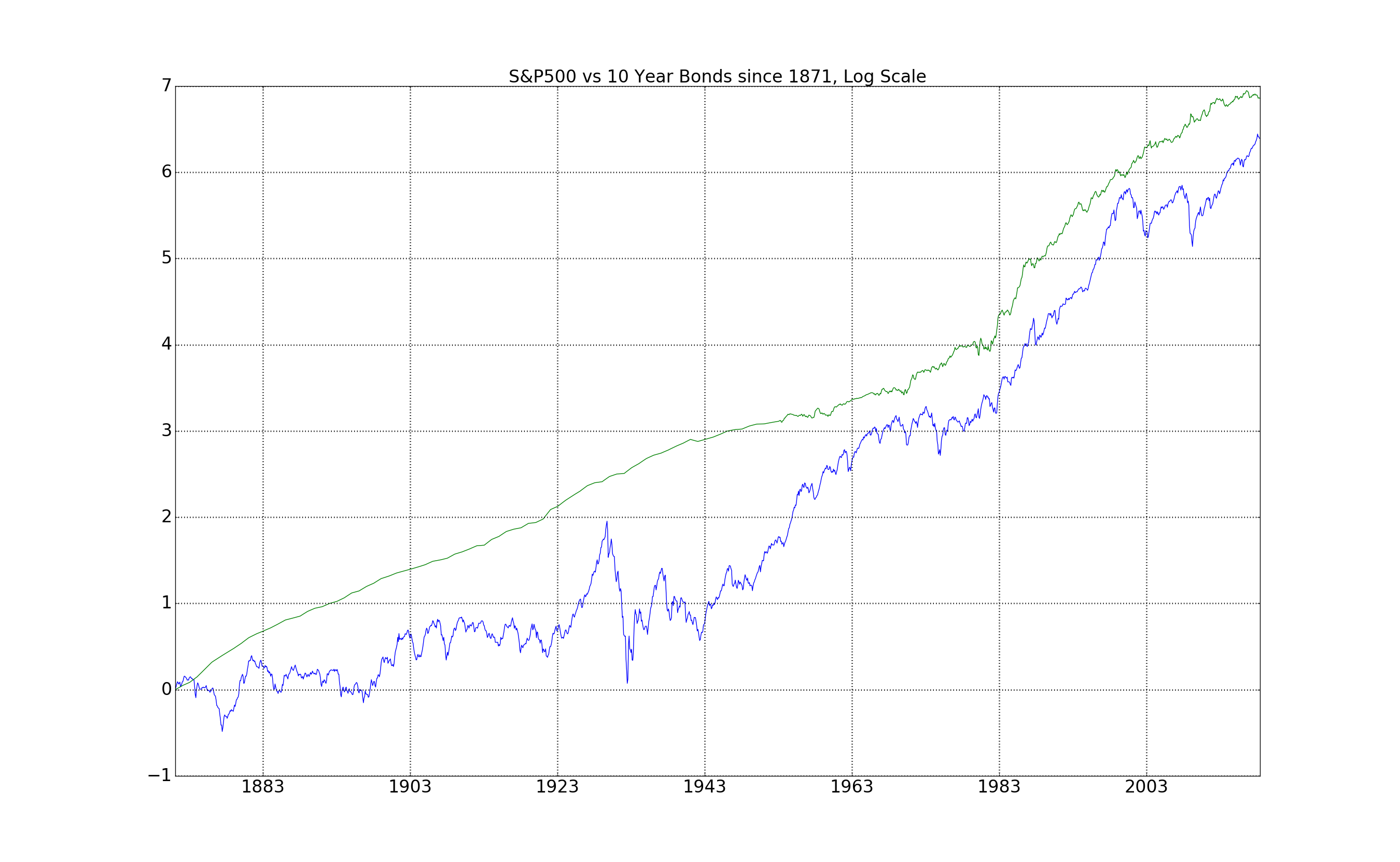
At first glance, the results are quite striking: over the last 150 years bonds and equities have performed nearly in sync. There are some structural differences, however, throughout the time period. Since the 1930s it’s clear that equities have significantly outperformed bonds: they start from a complete low point, and yet reach the current highs of our bond index.
Previous Bond Bear Markets: How Bad Does it Get?
The whole point of this exercise of constructing a price index from bond yields was to answer the question of what happened during previous bond bear markets.
The conventional wisdom is that fixed income securities decrease in price when yields go up. However, as we saw previously, it’s not only the value of the notional of the bond that contributes to the value of the bond. It’s also the coupon that you earn during the life-time of the bond.
The caveat here, is the speed with which rates start to increase. The rate of change will influence the decline of bond prices, and if it’s too fast, the coupon might not make up for it.
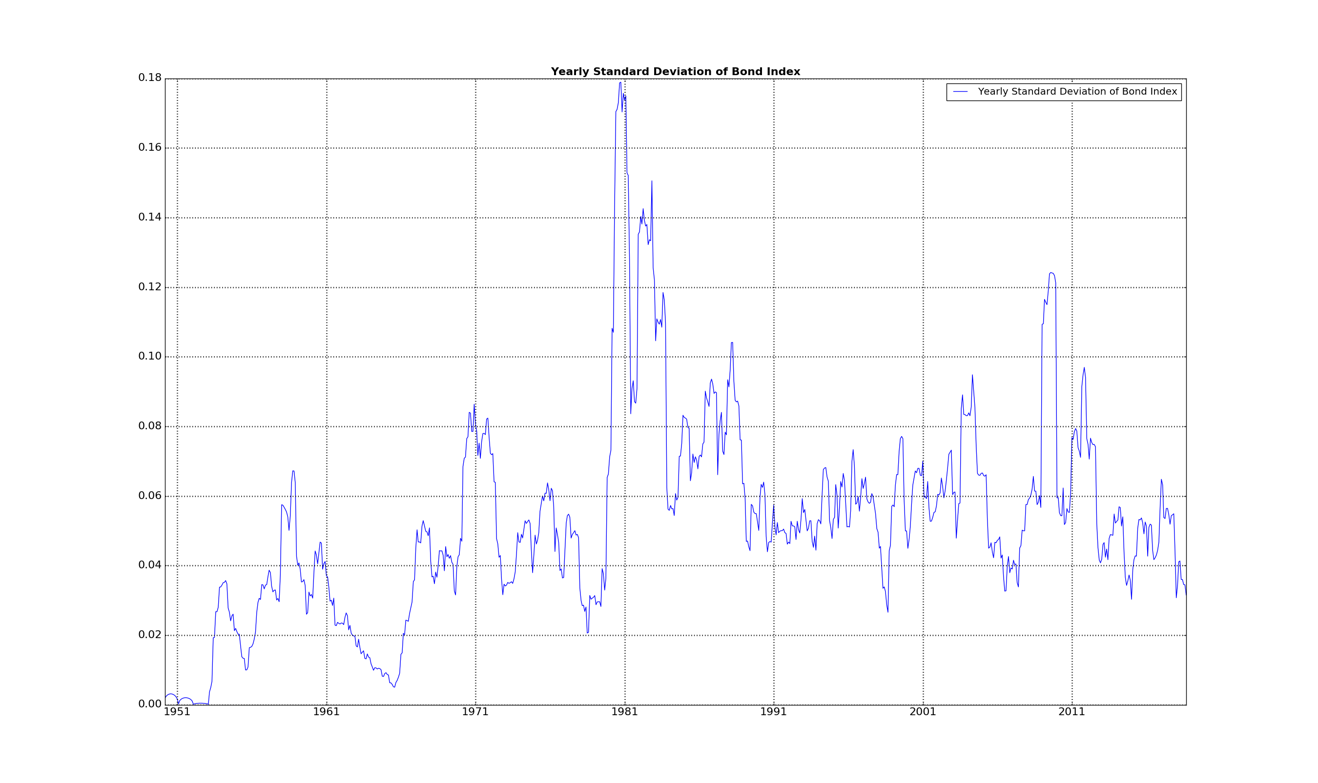
To get a better picture of the relationship between rising and declining interest rate regimes, let’s plot the bond index versus the underlying 10 year rate:
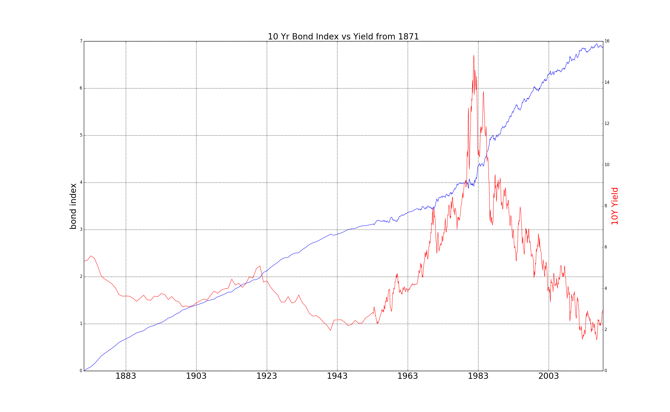
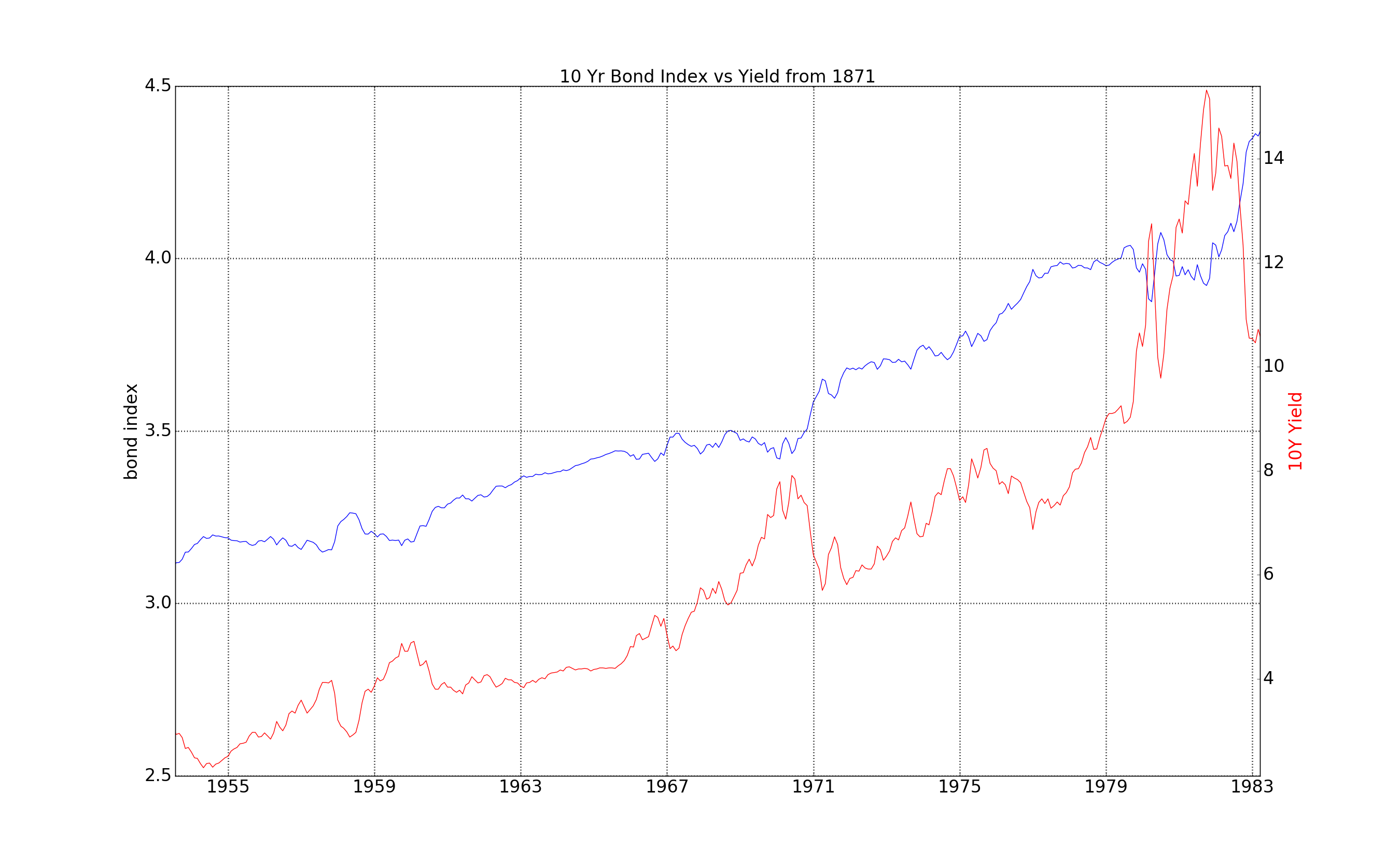
The part we naturally want to focus on for this article is the section which experienced the previous big updraft in rates: 1953 to 1982.
And this is really the punch-line: bond prices appreciated… a bit. Coming back to coupon income vs capital appreciation, let’s plot out the two components during this time period:
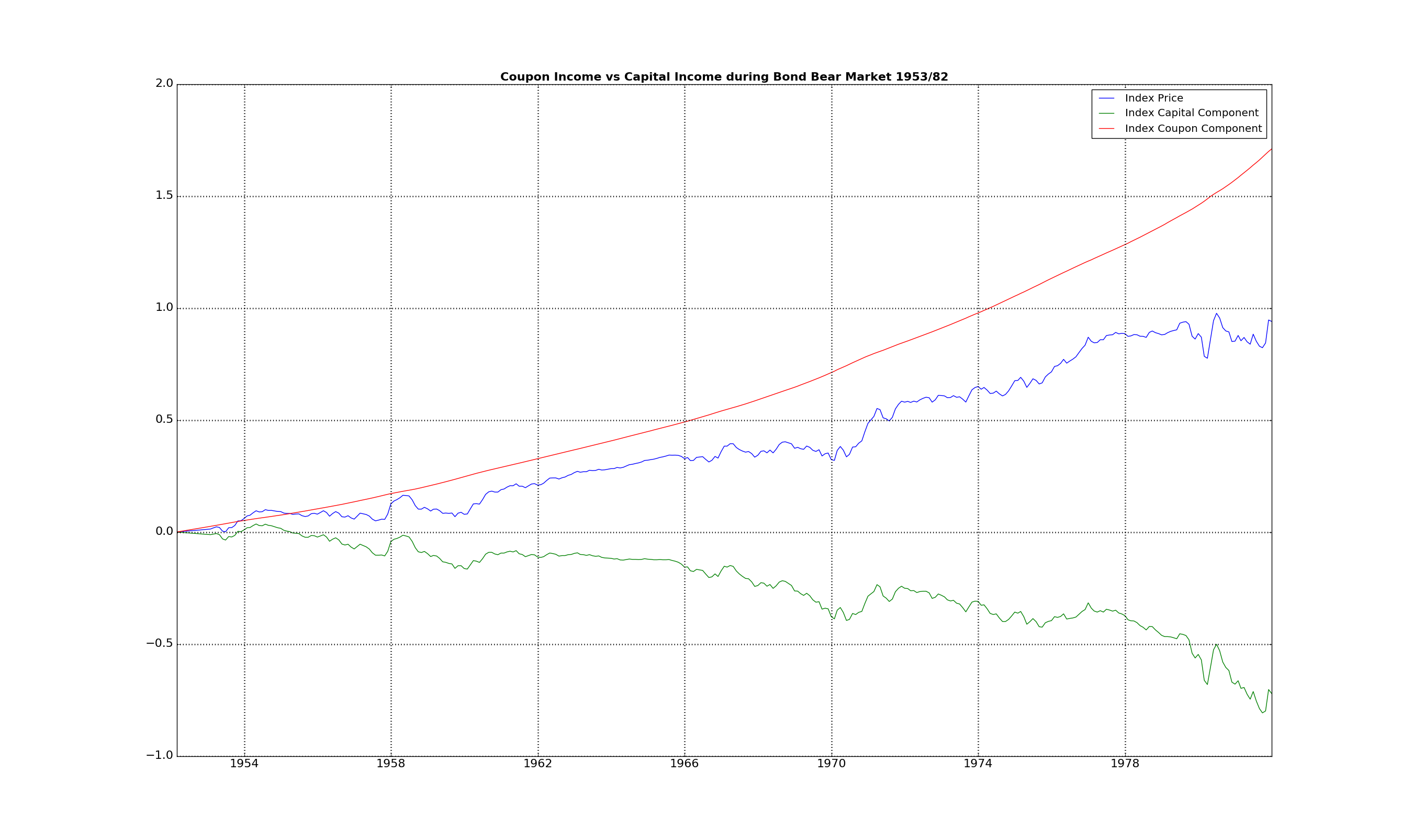
The high rates covered for the capital losses.
However, most importantly, volatility was contained during most time periods:
Looking Forward to Part 2
This has been a pretty lengthy article, so we’ll take a break here…
To summarize: in this article we’ve covered the nature of bonds, and the relationship between their prices and current yields.
Most importantly we’ve formulated a framework to help us navigate bond price behavior over a longer time horizon, so that we can create a historical lab for testing how bonds and their inclusion in equity portfolios will impact returns.
The relevant points here are:
- Bonds make money both on the the interest payments they receive
- They also are make or lose money on the appreciation of the capital depending on how interest rates move
- Falling rates don’t always mean losing money. It depends how quickly they fall with respect to the income the bond generates
So where do we go with this?
Now that we have a lab setup we can ask questions as to how an equity / bond portfolio did perform in the past. And equally exciting: since interest rates mean revert, we can project their behavior into the future and figure out how a rising rate environment might affect our equity / bond portfolio.
Recall that the main focus of the article series is to understand how each asset can contribute to our portfolio. So gaining an insight into the future by performing simulations is quite exciting!
In the meantime, the Python Code for all the diagrams in this article is included here, so that you can go ahead and conduct your own experiments.
So, until next time,
Happy Trading.
If you have enjoyed this post follow me on Twitter and sign-up to my Newsletter for weekly updates on trading strategies and other market insights below!
Get Your Action Guide Here:

7 Steps To Trading Success – 7 Steps that will increase your trading Success TODAY
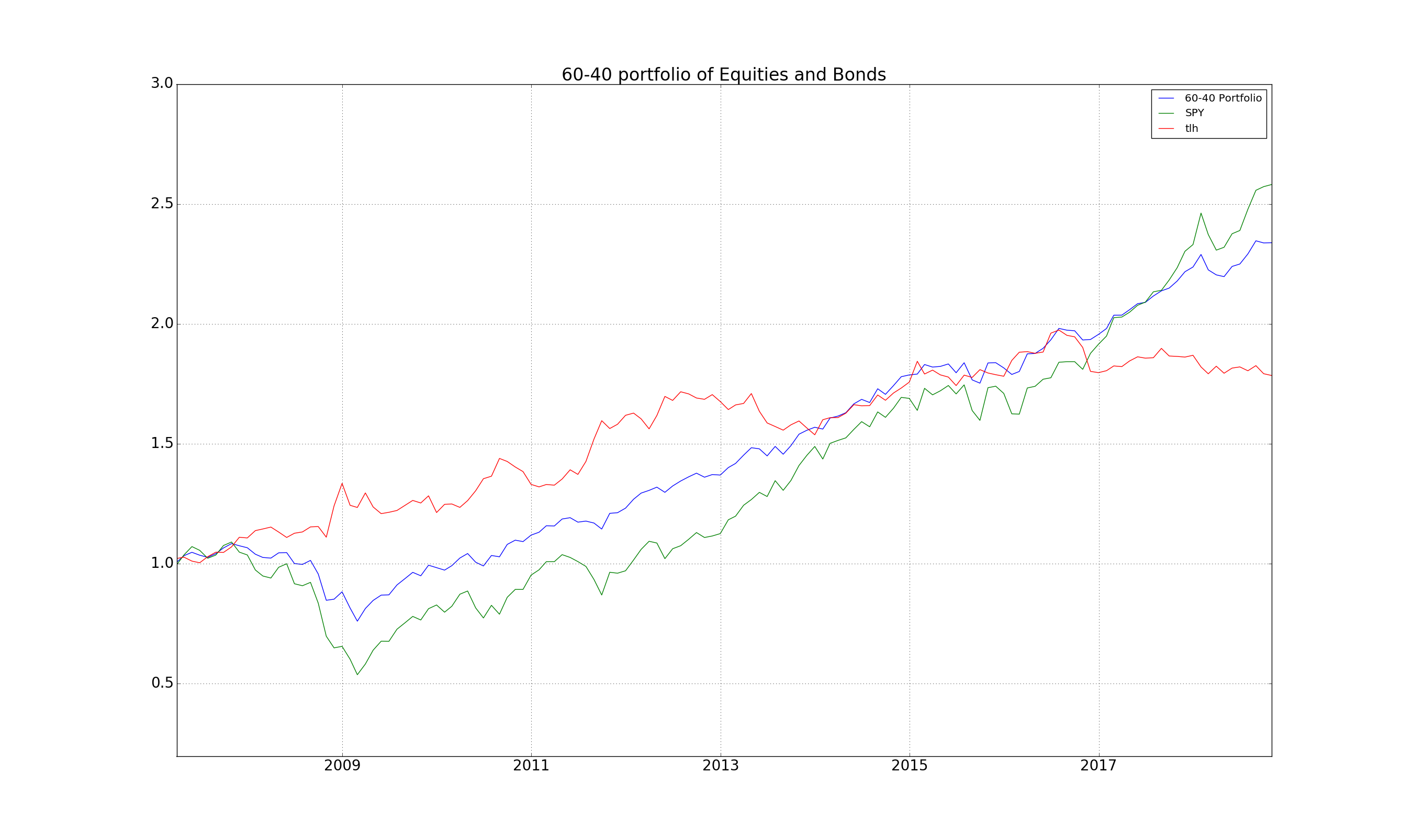
Quick Review of the Last Six Months
It’s been six months since I wrote the last article, and with time flying it’s always a good exercise to review how systems have performed. These walk forward tests tend to satisfy two important points
- Re-affirm that the initial principles were valid
- Keep your eyes open for any regime shifts
And with such a turbulent market environment (from trade wars, domestic US issues, to European Brexit, as well as tech stock problems) it’s good to see that principles still hold. Here is the 60% Equity – 40% Bond portfolio holding as it has fared since the start of 2008 as well as the recovery after the Volatility shakes in February:
Python Code
Here is the Python Code that produces the diagrams in this post.
You might not have some of the modules which are used here, and so you will have to pip install them.
In particular:
- Quandl (for which you should get an API key for free here: Quandl API Key). This module enables you to grab lots of free market data, in particular the FRED Treasury Rate series going back to the 60s
- requests, which will allow you easy access and downloads from the internet
- numpy and pandas, which are standard numerical analysis and data manipulation modules
- matplotlib which is the de facto plotting module in Python
- fix_yahoo_finance, which bypasses the issue in pandas for obtaining Yahoo Finance data
1 2 3 4 5 6 7 8 9 10 11 12 13 14 15 16 17 18 19 20 21 22 23 24 25 26 27 28 29 30 31 32 33 34 35 36 37 38 39 40 41 42 43 44 45 46 47 48 49 50 51 52 53 54 55 56 57 58 59 60 61 62 63 64 65 66 67 68 69 70 71 72 73 74 75 76 77 78 79 80 81 82 83 84 85 86 87 88 89 90 91 92 93 94 95 96 97 98 99 100 101 102 103 104 105 106 107 108 109 110 111 112 113 114 115 116 117 118 119 120 121 122 123 124 125 126 127 128 129 130 131 132 133 134 135 136 137 138 139 140 141 142 143 144 145 146 147 148 149 150 151 152 153 154 155 156 157 158 159 160 161 162 163 164 165 166 167 168 169 170 171 172 173 174 175 176 177 178 179 180 181 182 183 184 185 186 187 188 189 190 191 192 193 194 195 196 197 198 199 200 201 202 203 204 205 206 207 208 209 210 211 212 213 214 215 216 217 218 219 220 221 222 223 224 225 226 227 228 229 230 231 232 233 234 235 236 237 238 239 240 241 242 243 244 245 246 247 248 249 250 251 252 253 254 255 256 257 258 259 260 261 262 263 264 265 266 267 268 269 270 271 272 273 274 275 276 277 278 279 280 281 282 283 284 285 286 287 288 289 290 291 292 293 294 295 296 297 298 299 300 301 302 303 304 305 306 307 308 309 310 311 312 313 314 315 316 317 318 319 320 321 322 323 324 325 326 327 328 329 330 331 332 333 334 335 336 337 338 339 340 341 342 343 344 345 346 347 348 | ''' Script for accessing Quandl and Schiller data as well as Bond ETF data and generating Bond indexes going back to 1871 and comparing them to the ETF data. ''' import math import io import quandl import requests import datetime as dt import numpy as np import pandas as pd import fix_yahoo_finance as yf import matplotlib.pyplot as plt from collections import OrderedDict from pandas_datareader import data as pdr yf.pdr_override() ak = XXXXX # INSERT FREE QUANDL KEY HERE from here: https://help.quandl.com/article/320-where-can-i-find-my-api-key TRS = OrderedDict([('M01', 'FED/RIFLGFCM01_N_B'), ('M03', 'FED/RIFLGFCM03_N_B'), ('M06', 'FED/RIFLGFCM06_N_B'), ('Y01', 'FED/RIFLGFCY01_N_B'), ('Y02', 'FED/RIFLGFCY02_N_B'), ('Y03', 'FED/RIFLGFCY03_N_B'), ('Y05', 'FED/RIFLGFCY05_N_B'), ('Y07', 'FED/RIFLGFCY07_N_B'), ('Y10', 'FED/RIFLGFCY10_N_B'), ('Y20', 'FED/RIFLGFCY20_N_B'), ('Y30', 'FED/RIFLGFCY30_N_B'), ]) def plot_yld(df, yld='M03'): ''' Plots a column from the dataframe f, which contains the Quandl Treasury Rates labelled by the columns above :param df: Quandl Treasury Rates :param yld: Labelling which column to plot, can be a list of strings for multiple rate series ''' if type(yld) == list: for i in yld: plt.plot(df[i], label=i) else: plt.plot(df[yld], label=yld) plt.title('Chart of ' + yld + ' government bond yield') plt.title('Chart of government bond yield') plt.grid() plt.legend() plt.show() def get_trs(cache=True): ''' Function to download the Quandl Treasury Rates :param cache: If False will download and store rates in a pkl file. If True will load pickle file :return: Resulting DataFrame with Treasury rates from Quandl ''' if cache: try: df = pd.read_pickle("rates.pkl") except: pass else: return df df = pd.DataFrame() for k, v in TRS.items(): s = quandl.get(v, api_key=ak) s.rename(columns={'Value': k}, inplace=True) df = df.join(s, how='outer') df = df.replace(0, pd.np.nan).ffill() df.to_pickle("rates.pkl") return df def simulate_bond(df, yld='Y01', mat=1, freq=360, pfreq=2): ''' Bond Index price simulation :param df: DataFrame with Treasury Rates from Quandl :param yld: Identifies which Rate in the DataFrame to use :param mat: Maturity of bond considered, e.g. for Y01, mat = 1 :param freq: Frequency of rate observations, e.g. for monthly observations freq = 12 :param pfreq: Payment frequency. E.g. for US Bonds pfreq=2, for German bonds pfreq = 1 :return: A dataframe containing the various components of the Bond Index Series ''' if not type(yld) == list: yld = [yld] rates = df[yld] rates.columns = ['rate'] rates['rate'] = rates.rate / 100.0 rates['capital'] = (1 + rates.rate / pfreq).pow(-pfreq * mat) rates['annuity'] = rates.rate.shift(1) / rates.rate * (1 - rates.capital) rates['coupon'] = rates.rate.shift(1) / freq rates['ret'] = rates.capital + rates.annuity + rates.coupon - 1 rates['p_c'] = np.exp((rates.capital + rates.annuity - 1).cumsum()) rates['c_c'] = np.exp(rates.coupon.cumsum()) rates['px'] = (1 + rates.ret).cumprod() return rates def resample_ylds(df: pd.DataFrame): ''' Simple function to resample rates to monthly observations. Assumption is that DataFrame index contains time. ''' df = df.resample('M').last() return df def get_symbol(sym): ''' Wrapper for getting tickers from Yahoo :param sym: Yahoo ticker. E.g. AGG for AGG ETF :return: DataFrame with Yahoo Finance price data ''' df = pdr.get_data_yahoo(sym, start='1990-01-01', end=dt.date.today().strftime('%Y-%m-%d')) print(df.shape) return df def simb(symb='TLH', yld='Y10', mat=10, freq=12, pfreq=2): ''' Function to plot bond price simulation versus ETF Price :param symb: Yahoo ETF Ticker :param yld: Label of rate from Quandl Treasury Rate data :param mat: Maturity of bond considered :param freq: Observation frequency :param pfreq: Payment frequency of bond ''' ylds = get_trs(True) ylds = ylds[ylds.index >= dt.datetime(2008, 8, 1)] ylds_monthly = resample_ylds(ylds) bnd_px = simulate_bond(ylds_monthly, yld=yld, mat=mat, freq=freq, pfreq=pfreq) tlh = get_symbol(symb) tlh = tlh[tlh.index >= dt.datetime(2008, 8, 1)] tlh_monthly = tlh.resample('M').last() tlh_monthly['px'] = tlh_monthly['Adj Close'] / tlh_monthly.ix[dt.datetime(2008, 8, 31), 'Adj Close'] fig = plt.figure() ax = fig.add_subplot(1, 1, 1) fig.hold(True) ax.plot(bnd_px.index, bnd_px.px, label="30Yr Bond Index") ax.plot(bnd_px.index, bnd_px.p_c, label="Capital Component") ax.plot(bnd_px.index, bnd_px.c_c, label="Coupon Component") ax.plot(tlh_monthly.index, tlh_monthly.px, label="TLT ETF") vals = ax.get_yticks() ax.set_yticklabels(['{:3.2f}'.format(x * 100.0) for x in vals]) plt.legend() plt.grid() plt.title('TLT ETF vs 30 Yr Simulated Bond Index') plt.show() def sim_agg(cached=True): ''' Function to simulate AGG ETF using a weighted average of the bond indexes generated from Quandl Treasury Rates ''' tlh = get_symbol('AGG') tlh = tlh[tlh.index >= dt.datetime(2008, 8, 1)] tlh_monthly = tlh.resample('M').last() tlh_monthly['px'] = tlh_monthly['Adj Close'] / tlh_monthly.ix[dt.datetime(2008, 8, 31), 'Adj Close'] vol = (tlh_monthly.px / tlh_monthly.px.shift(1) - 1).std() ylds = get_trs(cached) ylds = ylds[ylds.index >= dt.datetime(2008, 8, 1)] ylds_monthly = resample_ylds(ylds) px_l = ['Y01', 'Y02', 'Y03', 'Y05', 'Y07', 'Y10', 'Y20', 'Y30'] ret = 0 fig = plt.figure() ax = fig.add_subplot(1, 1, 1) fig.hold(True) for y in px_l: bnd = simulate_bond(ylds_monthly, yld=y, mat=int(y[1:]), freq=12, pfreq=2) bnd.ret = bnd.ret / bnd.ret.std() * vol # ax.plot(bnd.index,bnd.px, label=y) ret = ret + bnd.ret / len(px_l) px = (1 + ret).cumprod() ax.plot(px.index, px, label='Simulation') ax.plot(tlh_monthly.index, tlh_monthly.px, label='AGG') plt.legend() plt.grid() plt.title('TLT ETF vs 30 Yr Simulated Bond Index') plt.show() print((px / px.shift(1) - 1).std()) print(vol) return [px, tlh_monthly] def makedt(x): ''' Helper function to convert Date column in Schiller data to Python datetime.date object ''' d = dt.datetime.strptime(x, '%Y.%m') + dt.timedelta(days=32) d = d.replace(day=1) d = d - dt.timedelta(days=1) return d def get_schiller(): ''' Function to grab and return as a DataFrame the time series for 10Y rates and SP500 since 1871 ''' url = 'http://www.econ.yale.edu/~shiller/data/ie_data.xls' response = requests.get(url) f = io.BytesIO(response.content) names = ['Dates', 'SP500', 'Dividend', 'Earnings', 'CPI', 'DateF', 'T10Y', 'RealPrice', 'RealDiv', 'RealEarn', 'CAPE'] df = pd.read_excel(io=f, sheet_name='Data', skiprows=7, skip_footer=1, names=names, usecols="A:K") df['Dates'] = df['Dates'].apply(lambda x: "{:0.2f}".format(x)).apply(makedt) return df def long_term_bond(): ''' Function to plot S&P500 and 10Y Bond Index from Schiller Data ''' df = get_schiller() px = simulate_bond(df, yld='T10Y', mat=10, freq=12, pfreq=2) a = df.SP500 / df.SP500[0] b = px.px / px.px[1] ix = df['Dates'] plt.plot(ix, np.log(a), ix, np.log(b)) ax = plt.gca() ax.xaxis.set_tick_params(labelsize=24) ax.yaxis.set_tick_params(labelsize=24) plt.grid(linewidth=2) plt.title('S&P500 vs 10 Year Bonds since 1871, Log Scale', fontsize=24) plt.show() def px_vs_yld(stdt=None, eddt=None): ''' Function to plot Bond Index price versus the corresponding Yield between a start and end date ''' df = get_schiller() px = simulate_bond(df, yld='T10Y', mat=10, freq=12, pfreq=2) b = np.log(px.px / px.px[1]) ix = df['Dates'] if (stdt is None) or (eddt is None): iix = pd.Series(len(ix) * [True]) else: iix = (ix > stdt) & (ix < eddt) fig, ax1 = plt.subplots() ax1.plot(ix[iix], b[iix]) ax1.set_ylabel('bond index', fontdict={'size': 24}) ax1.xaxis.set_tick_params(labelsize=24) plt.grid(linewidth=2) ax2 = ax1.twinx() ax2.plot(ix[iix], df['T10Y'][iix], color='red') ax2.set_ylabel('10Y Yield', color='red', fontdict={'size': 24}) ax1.yaxis.set_tick_params(labelsize=24) ax2.yaxis.set_tick_params(labelsize=24) plt.title('10 Yr Bond Index vs Yield from 1871', fontsize=24) plt.show() def bx_coup_cap(stdt=None, eddt=None): ''' Function to plot Capital and Coupon contributions to Bond Index simulated from Schiller Data ''' df = get_schiller() ix = df['Dates'] if (stdt is None) or (eddt is None): iix = pd.Series(len(ix) * [True]) else: iix = (ix > stdt) & (ix < eddt) px = simulate_bond(df[iix], yld='T10Y', mat=10, freq=12, pfreq=2) plt.plot(df['Dates'][iix], np.log(px.px / px.px.iloc[1]), df['Dates'][iix], np.log(px.p_c / px.p_c.iloc[1]), df['Dates'][iix], np.log(px.c_c / px.c_c.iloc[1])) ax = plt.gca() ax.yaxis.set_tick_params(labelsize=16) ax.xaxis.set_tick_params(labelsize=16) plt.legend(['Index Price', 'Index Capital Component', 'Index Coupon Component']) plt.grid(linewidth=2) plt.title('Coupon Income vs Capital Income during Bond Bear Market 1953/82', fontdict={'fontsize': 16, 'fontweight': 'bold'}) plt.show() def bx_vol(stdt=None, eddt=None): ''' Function to plot the realized price volatility of a Bond Price index simulated from Schiller's Data ''' df = get_schiller() ix = df['Dates'] if (stdt is None) or (eddt is None): iix = pd.Series(len(ix) * [True]) else: iix = (ix > stdt) & (ix < eddt) px = simulate_bond(df[iix], yld='T10Y', mat=10, freq=12, pfreq=2) ret = px.px / px.px.shift(1) - 1 ss = ret.rolling(window=12).std() * math.sqrt(12) # 2 year realized volatility plt.plot(df['Dates'][iix], ss) # , df['Dates'][iix], ss.rolling(window=24).mean()) # 2 year vol and average over 100 months ax = plt.gca() ax.yaxis.set_tick_params(labelsize=16) ax.xaxis.set_tick_params(labelsize=16) plt.legend(['Yearly Standard Deviation of Bond Index']) plt.title('Yearly Standard Deviation of Bond Index', fontdict={'fontsize': 16, 'fontweight': 'bold'}) plt.grid(linewidth=2) plt.show() if __name__ == "__main__": run_option = 1 if run_option == 1: # Figure of Treasury Rates from Quandl df = get_trs(False) plot_yld(df,yld=['Y01', 'Y10']) elif run_option == 2: # Comparison of bond index vs TLT simb(symb='TLT', yld='Y30', mat=30, freq=12, pfreq=2) elif run_option == 3: # AGG simulation sim_agg() elif run_option == 4: # Bond Index vs SP500 from Schiller data long_term_bond() elif run_option == 5: # Bond price index vs 10 Yr Yield from Schiller Data px_vs_yld() px_vs_yld(stdt = dt.date(1952,1,1), eddt=dt.date(1982,1,1)) elif run_option == 6: # Capital and Coupon contributions for 10Yr Rate from Schiller Data bx_coup_cap(stdt=dt.date(1952,1,1), eddt=dt.date(1982,1,1)) elif run_option == 7: # Bond Index Volatility bx_vol(stdt=dt.date(1949, 1, 1), eddt=dt.date(2019, 1, 1)) |

Leave a Reply